The short answer: Three rules cover most of it. (1) Match temperature — warm rooms (beige, cream, gold, terracotta) need warm portraits; cool rooms (gray, blue, sage, white) need cool portraits. (2) Apply the 60-30-10 rule — your portrait should echo the 30% secondary color or introduce a 10% accent. (3) Account for wall color — gray walls flatter warm portraits, beige walls flatter warm portraits, navy walls flatter saturated palettes. Preview multiple palettes in PawFav against the actual wall before printing.
The difference between a pet portrait that looks perfect on your wall and one that looks oddly out of place usually isn't the style or the quality — it's the color palette. This guide teaches the fundamentals of color theory as they apply to pet portraits and home decor: warm vs cool tones, complementary and analogous color relationships, how your wall color changes how a portrait looks, the 60-30-10 decorating rule for placing art, room-by-room palette recommendations, how your pet's natural coloring interacts with artistic palettes, and how to use PawFav's instant preview to test color harmony before spending a cent on printing.
Disclosure: PawFav is our own product. We've aimed to keep this guide's color advice useful and accurate regardless of which tool or service you ultimately use.
- Match temperature: warm portrait + warm room, cool portrait + cool room
- Apply the 60-30-10 rule: portrait echoes the 30% or becomes the 10% accent
- Wall color matters: gray and beige walls flatter warm portrait palettes
- Preview against the actual wall — screens lie about how prints look
You found a gorgeous pet portrait. The style is perfect. The likeness is spot on. You print it, hang it, step back, and something feels wrong. Not bad, exactly, just not quite right. Like it belongs in someone else's home.
Nine times out of ten, the problem is color. Not the wrong color, but the wrong relationship between the colors in the portrait and the colors already in your room. This is the part of decorating that interior designers understand intuitively and the rest of us struggle with silently.
The good news: color theory isn't complicated once someone explains it plainly. And once you understand it, you'll never accidentally hang a clashing portrait again.
Are Warm or Cool Tones Better for Pet Portraits?
Answer: Neither is inherently better — the right temperature depends on your room. Match temperature to temperature: warm rooms (beige, cream, gold, terracotta walls or furniture) need warm portrait palettes. Cool rooms (gray, blue, sage, cool white) need cool portrait palettes. Mismatching temperature creates subtle visual friction that the eye picks up even when the brain cannot name the problem.
Every color leans either warm or cool, and this is the single most important thing to get right.
Warm tones include reds, oranges, yellows, terracotta, gold, cream, blush, and warm browns. They feel inviting, cozy, and grounding. Most living rooms and bedrooms lean warm.
Cool tones include blues, greens, grays, lavender, silver, and cool whites. They feel calm, modern, and airy. Bathrooms, home offices, and contemporary spaces often lean cool.
Here's the rule: your portrait's dominant palette should match the temperature of your room. A warm-toned watercolor portrait with dusty rose and amber feels at home on a cream wall. That same portrait on a cool gray wall creates subtle visual friction your eye picks up even if your brain can't name it.
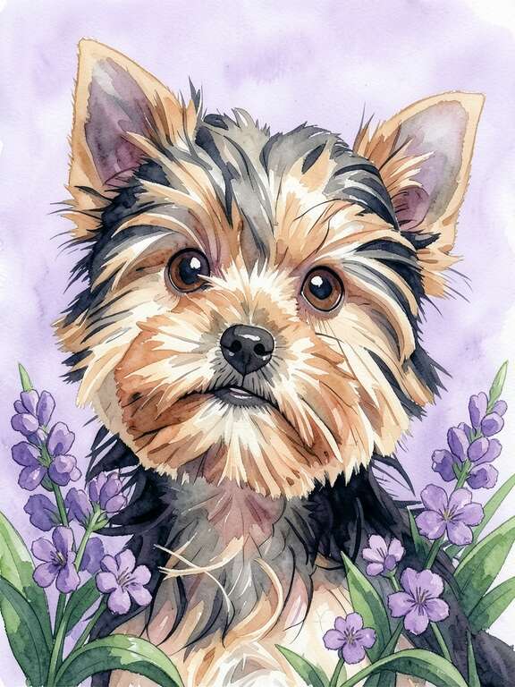
🔥 Warm Portrait Palettes
Best for: Living rooms, bedrooms, farmhouse, boho, and traditional spaces. Pairs with cream, beige, warm white, and wood-toned walls.
❄️ Cool Portrait Palettes
Best for: Home offices, bathrooms, modern apartments, Scandinavian, and minimalist spaces. Pairs with gray, cool white, navy, and blue-green walls.
What Are Complementary and Analogous Colors for Pet Portraits?
Answer: Three color relationships matter most. Analogous colors sit next to each other on the wheel (blue-green, red-orange) and feel harmonious — use for blending portraits into a room. Complementary colors sit opposite (blue-orange, purple-yellow) and create energy — use for statement focal points. Neutral + accent means a neutral room with a colorful portrait providing all the personality — the safest approach for modern homes.
Beyond warm vs cool, understanding three basic color relationships helps you choose portraits that feel intentional rather than accidental.
Analogous Colors (Neighbors on the Color Wheel)
Colors that sit next to each other on the color wheel: blue and green, red and orange, yellow and gold. Analogous palettes feel harmonious and soothing because they share underlying tones. A pet portrait in warm amber tones on a wall near terracotta throw pillows uses an analogous relationship. Everything hums together.
Use analogous when: You want the portrait to blend seamlessly into the room. The portrait complements rather than commands. Best for bedrooms, reading nooks, and calm spaces.
Complementary Colors (Opposites on the Color Wheel)
Colors that sit across from each other: blue and orange, purple and yellow, red and green. Complementary pairs create visual energy and contrast. A deep navy pet portrait on a warm amber wall uses complementary tension, and the result is vibrant and eye-catching.
Use complementary when: You want the portrait to pop as a focal point. Statement pieces, entryways, and gallery walls benefit from complementary energy.
Neutral + Accent
A neutral room (white, gray, beige, cream) with a colorful portrait as the only strong color element. This is the safest approach because the neutral room defers to whatever palette the portrait brings. It's also the most common situation in modern homes.
Use neutral + accent when: Your room is already neutral and you want the portrait to provide all the color personality. This is how most dog moms naturally decorate, and it works beautifully.
What Is the 60-30-10 Rule for Pet Portraits?
Answer: The 60-30-10 rule is an interior design principle that balances color in a room. 60% dominant (walls, large furniture). 30% secondary (upholstery, curtains, rugs). 10% accent (small pops of color, including art). Your pet portrait should either echo the 30% secondary color to feel coordinated, or introduce a new color as the 10% accent to act as a focal point. What doesn't work is a portrait that conflicts with both zones.
The Interior Designer's Secret Formula
Professional designers use the 60-30-10 rule to balance color in every room. Here's how it works with pet portraits:
60% Dominant: Your walls, large furniture, and major surfaces. This sets the room's base tone.
30% Secondary: Upholstery, curtains, rugs, and large accessories. This adds depth.
10% Accent: Small pops of color: throw pillows, vases, and art. Your pet portrait lives here or in the 30% zone.
If your portrait's main colors echo the 30% secondary (like matching your sofa's tone), it feels like it belongs. If the portrait introduces a new color as the 10% accent, it becomes an intentional focal point. Either approach works. What doesn't work is a portrait that conflicts with both the 30% and 60%.
How Does Wall Color Affect Pet Portrait Choice?
Answer: Wall color dramatically changes how a portrait reads. White walls are forgiving but can wash out pale portraits. Gray walls make warm portraits glow and cool portraits recede. Navy/dark walls create gallery drama with saturated styles. Beige/cream walls are ideal for warm-palette portraits. Sage/green walls pair beautifully with dusty rose and gold portraits as complementary contrast.
The same portrait looks dramatically different depending on the wall behind it. This is the most under-discussed aspect of hanging art.
| Wall Color | Best Portrait Palettes | Avoid |
|---|---|---|
| White / Cool white | Anything saturated | Very pale, washed-out styles |
| Gray | Warm: terracotta, gold, dusty rose | Cool palettes (look flat) |
| Navy / Dark walls | Rich oil, Renaissance, jewel tones | Light, airy watercolors |
| Beige / Cream | Warm earthy, florals, soft watercolors | Very cool or neon palettes |
| Sage / Olive / Forest | Dusty rose, gold, warm neutrals | Green-dominant portraits |
| Blush / Pink | Sage, cream, soft gold | Hot pink or magenta palettes |
White walls are the most forgiving. Any portrait palette works because white doesn't compete. However, very pale or washed-out portrait styles can look lost on a white wall. Choose styles with enough color saturation to hold their own.
Gray walls make warm portraits glow and cool portraits recede. If your walls are gray, lean toward warm portrait palettes (terracotta, gold, dusty rose) for maximum impact. Cool-toned portraits on gray walls can look flat.
Navy or dark walls create a dramatic gallery effect. Portraits with rich, saturated colors (Renaissance, oil painting) look incredible on dark walls. Light, airy watercolors may get lost. The contrast between a bright portrait and a dark wall is one of the most striking display combinations.
Beige and cream walls are warm and neutral, making them ideal for warm-palette portraits. Earthy tones, florals, and soft watercolors feel natural here. Very cool or very bright portraits may clash.
Green (sage, olive, forest) walls are trending in 2026. Dusty rose and blush portraits create a beautiful complementary contrast on green walls. Gold and warm neutrals also work well. Avoid green-dominant portraits on green walls, as they'll merge together.
Does My Pet's Fur Color Affect the Portrait Palette?
Answer: Yes — your pet is already a color element. Golden/red pets (golden retrievers, orange tabbies) shine in warm palettes. Gray/silver pets (Russian Blues, Weimaraners) look stunning in cool palettes. Black pets are essentially neutral and pop against any bold palette. White pets need medium-toned backgrounds (dusty rose, sage, terracotta) for definition. Multi-colored pets already carry their own palette — choose a style that highlights their dominant color.
Here's something most portrait guides overlook: your pet is already a color element. A golden retriever has warm tones built in. A gray cat carries cool tones. A black lab is essentially neutral. The portrait style you choose should work with your pet's natural coloring, not fight it.
Golden and red-coated pets (golden retrievers, red setters, orange tabbies) shine in warm palettes. Terracotta backgrounds, amber-toned watercolors, and warm oil painting styles amplify their natural warmth. Cool blue backgrounds can create interesting contrast but may feel unnatural.
Gray and silver-coated pets (Russian Blues, Weimaraners, silver tabbies) look stunning in cool palettes. Sage, lavender, and cool gray backgrounds complement their natural tones. Monochrome and pencil sketch styles are particularly effective.
Black-coated pets are essentially neutral and work with any palette. Bold backgrounds (Renaissance gold, pop art bright, deep jewel tones) make black pets pop dramatically. Avoid dark backgrounds that swallow their features.
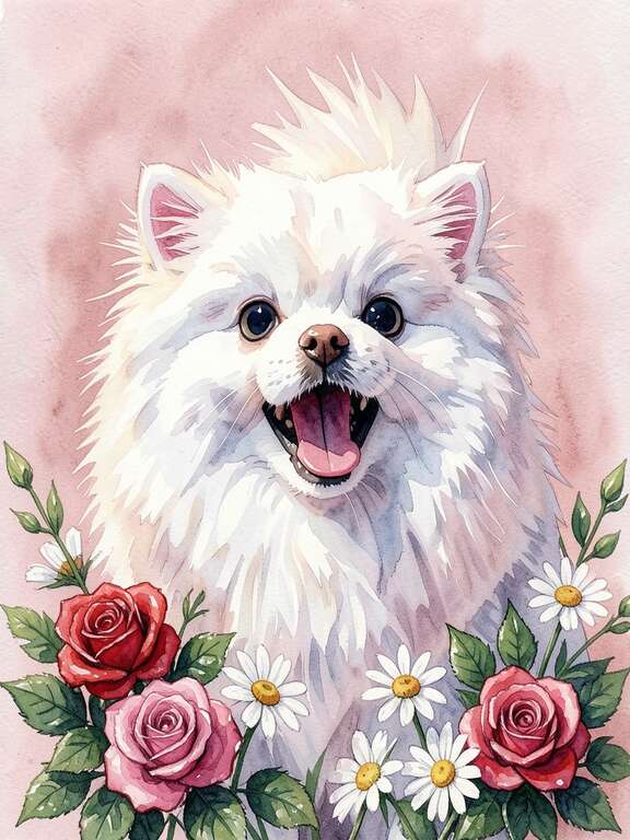
White-coated pets need backgrounds with enough color to provide contrast. White-on-white looks washed out. Dusty rose, sage, terracotta, and medium-toned backgrounds create the definition white pets need.
Multi-colored and patterned pets already carry their own palette. Choose a portrait style that highlights their dominant color. If your calico cat is mostly orange, a warm palette ties the portrait together around that dominant note.
What Pet Portrait Colors Work Best in Each Room?
Answer: Living room = warm earthy palettes (terracotta, dusty rose, sage). Bedroom = soft calming tones (blush, lavender, muted sage). Home office = focused jewel tones or monochrome. Entryway = bold dramatic palettes that make first impressions. Kitchen = warm cheerful brights. Bathroom = spa cool sage or playful pop art for powder rooms.
🛋️ Living Room
Warm, inviting palettes. Terracotta, dusty rose, warm neutrals, sage green. Oil painting and watercolor styles. 16x20 or larger for statement impact.
🛏️ Bedroom
Soft, calming palettes. Blush, lavender, muted sage, cream. Watercolor and pencil sketch. Avoid high-contrast or neon palettes that energize rather than calm.
💼 Home Office
Focused, not distracting. Cool neutrals, deep jewel tones, monochrome. Oil painting, Renaissance (humor without visual chaos), minimalist line art.
🚪 Entryway
Bold and welcoming. Rich colors that make an impression: deep gold, rich terracotta, dramatic Renaissance. This is where high-contrast complementary palettes shine.
🍳 Kitchen
Warm and cheerful. Bright watercolors, cartoon styles, warm pop art. Kitchens can handle more visual energy than bedrooms. Keep frames food-safe (no fabric mats near cooking).
🛁 Bathroom
Spa-like or playful. Cool sage, soft blue, or bright pop art (for powder rooms). Use moisture-resistant printing or sealed frames. Small sizes (8x10) suit bathroom walls.
How Do I Preview a Pet Portrait Against My Wall?
Answer: Generate multiple portraits in PawFav with different palettes (at least one warm and one cool), then hold your phone up against the actual wall where the portrait will hang. Stand back, view at eye level, in normal lighting. Compare versions one by one. The version that makes your eye relax is the right palette. Test in both morning natural light and evening artificial light — if it works in both, you've found your winner.
Here's where having an AI portrait app becomes a genuine decorating advantage. With PawFav, you can preview your pet in dozens of different color palettes instantly. But the real trick is what you do next.
Step 1: Create several portraits of your pet in different styles, each with a different dominant palette.
Step 2: Hold your phone up against the actual wall where the portrait will hang. In the room. In the actual lighting. At eye level.
Step 3: Compare. The version that makes your eye relax, the one that feels like it was always meant to be there, is the right palette. The versions that make your eye twitch, even subtly, have a color mismatch.
This in-context preview eliminates the most common decorating mistake: choosing art based on how it looks on a screen rather than how it looks in your specific room with your specific lighting and your specific wall color.
Preview at two different times of day. Morning natural light and evening artificial light change how colors read. A portrait that looks perfect in daylight might feel too warm (or too cool) under your evening lamp light. If it looks right in both conditions, you've found your winner.
What Are the Most Common Color Matching Mistakes?
Answer: Five common mistakes. (1) Matching colors too exactly — looks like a furniture set. (2) Ignoring undertones — beige is warm-neutral, gray is cool-neutral, not the same. (3) Choosing on screen instead of against the wall. (4) Forgetting the frame — wrong frame color clashes even if the portrait is right. (5) Adding a fourth competing palette to a room that already has three strong color elements.
- Matching too exactly. A portrait that perfectly matches your sofa doesn't look coordinated; it looks like you ordered them as a set. Aim for "in the same family" not "identical twins."
- Ignoring undertones. Beige walls have warm undertones. Gray walls have cool undertones. A "neutral" portrait that leans warm will clash with a cool gray wall even though both seem neutral.
- Choosing on screen. Screens emit light. Prints reflect light. Colors always look different printed than they do on your phone. The in-context preview (holding your phone against the wall) compensates for this.
- Forgetting the frame. A warm gold frame adds warmth to any portrait. A cool black frame adds modernity. The frame is part of the color equation. A portrait with perfect colors in the wrong frame can still clash.
- Too many competing palettes. If your room already has three strong color elements (a blue rug, green pillows, orange curtains), a portrait needs to echo one of those rather than introducing a fourth. Simplify.
"Once you start noticing color temperature in art, you can't stop. You'll walk into restaurants and notice why their art works. You'll scroll Instagram and immediately see why some gallery walls look professional and others don't. It all comes down to temperature harmony."
The Quick Cheat Sheet
If all of the above feels like a lot, here's the simplified version:
- Warm room? Choose a portrait with warm tones (gold, cream, terracotta, blush, amber).
- Cool room? Choose a portrait with cool tones (sage, gray, lavender, blue, silver).
- Neutral room? Choose any palette you love. The room will defer to the portrait's personality.
- Not sure? Preview in PawFav, hold your phone against the wall, and trust your eye. If it feels right, it is right.
Color theory sounds academic but it's really just giving a name to something your eye already knows. The goal isn't to memorize color wheels. It's to understand why some combinations feel good and others don't, and to have the tools to test before you commit.
Your pet deserves to look at home on your wall. With the right palette, they will.
Frequently Asked Questions About Pet Portrait Colors
Should a pet portrait match the wall color or contrast with it?
Both can work, but contrast almost always looks better. A warm-toned portrait on a cool gray wall creates visual tension that draws the eye. A portrait that exactly matches the wall blends in and disappears. The ideal is complementary contrast: portrait and wall share the same temperature (both warm or both cool) but differ in intensity or hue. A dusty rose portrait on a warm cream wall creates harmony with gentle contrast.
What pet portrait colors work on a gray wall?
Gray walls have cool undertones and make warm portraits glow while making cool-toned portraits recede. The best palettes for gray walls are warm: terracotta, dusty rose, gold, amber, and warm neutrals. Cool-toned portraits (blue, sage, lavender) on gray walls can look flat. If you want a cool portrait on a gray wall, choose one with significant tonal contrast — very light or very dark.
What color frame works best for pet portraits?
Match frame temperature to the room. Warm gold or wood frames pair well with traditional or warm-toned spaces. Black frames add modern contrast and work especially well with bold or pop art portraits. White frames feel airy and minimalist, ideal for watercolor and line art styles. A portrait with perfect colors in the wrong frame can still clash, so plan the frame as part of the color equation, not an afterthought.
Can I use the same pet portrait in different rooms?
Yes, but the room context will change how the portrait reads. A warm terracotta portrait that glows above the living room sofa might feel too energetic above a bedroom headboard. If you want to use one portrait across multiple rooms, choose a palette that's neutral enough to work everywhere — soft watercolors, muted pencil sketches, or balanced earthy tones. For room-specific impact, generate a different version for each room in PawFav.
What pet portrait colors work in a small space or apartment?
Small spaces benefit from lighter, brighter portrait palettes that don't visually shrink the room. Soft watercolors, blush tones, sage, and warm cream work well. Avoid very dark or heavily saturated portraits in small rooms — they can make walls feel like they're closing in. One bright statement piece works better than several competing colors in tight spaces.
How do I match a pet portrait to a colorful patterned sofa or rug?
Pull one dominant color from the patterned piece and echo that in the portrait, rather than trying to match the entire pattern. If your rug has navy, mustard, and rust, choose a portrait with a single one of those tones as its dominant. This creates visual cohesion without competing patterns. The 60-30-10 rule especially helps here: the rug becomes the secondary color, and the portrait becomes the accent that ties it back to the room.
Do printed pet portrait colors look the same as on screen?
No. Screens emit light; prints reflect light. Colors generally appear slightly more saturated and brighter on screen than they do printed. Warm tones can shift cooler in print and vice versa depending on paper or canvas. This is why holding your phone against the actual wall under real lighting matters — it gives you a closer approximation of how the printed portrait will look in context. Order from print services with color-accurate previews when possible.
Are AI-generated pet portraits color-accurate enough for serious decor?
Yes. PawFav delivers high-resolution files with consistent color profiles suitable for any consumer print service (Walgreens, Shutterfly, Amazon canvas, home printing). Because you can preview unlimited palette options before committing, AI generation actually gives you more color control than commissioning a single hand-painted piece sight-unseen. For complete printing guidance, see our pet portrait pricing guide.
Test Every Palette with Your Pet
Preview warm, cool, and neutral styles side by side. Hold your phone against the wall. Trust your eye. Free to try.
Try PawFav Free